Dimensionality reduction by graph drawing with the Laplacian
Another post on the Laplacian… but this time it’s spoooOOOOoooky!
Yesterday and today
Last time, I talked about the quadratic form of the Laplacian. I ended up going deeper into the optimization of the eigenfunctions than I expected to because it was pretty interesting, but I didn’t actually get around to applying it.
I’m supposed to have a flashy image way up front, to keep your attention, so here ya go:
Are you happy, you animals?
Today we will be applying it, even if it kills us. It’s a sacrifice I’m willing to make. In this context the quadratic form is often called the “graph drawing objective”.
(recommended listening while reading this post)
Graph drawing
As we saw last time, the quadratic form for the Laplacian $L$ and function $f$ is
\[E(f) = f^\intercal L f = \sum_{i, j} w_{ij} (f_i - f_j)^2\]and we can interpret it as:
- the function $f$ assigns a one dimensional position $f_i$ to node $i$
- node $i$ and node $j$ are connected by a spring of weight $w_{ij}$ that wants to pull them together
- then, $E(f)$ is the elastic potential energy of that system
- the eigenfunctions $v_k$ of $L$ are the functions such that:
- they have increasing energies, $E(v_k) = \lambda_k$
- the first one, $v_1$, is constant (i.e., all nodes pulled to the same position), and therefore has energy $\lambda_1 = 0$
- the next eigenfunction, $v_2$ is the function that has the lowest possible energy while being orthogonal to $v_1$
- and so on for the rest
That’s neat, but what can you do with that?
One cool application is what’s called “graph drawing”, because, uh, we use it to draw the graph $L$ is defined by. We’ll refer to the quadratic form above as the graph drawing (“GD”) objective from now on. The basic idea is pretty simple:
- we want to embed our nodes in $d$ dimensional space (i.e., assign each node a position in $\mathbb R^d$) such that in each dimension, they minimize the spring energy
- we know this is what the eigenfunctions do: each defines an energy minimizing layout in one dimension, in order of increasing energy
- therefore, if we want to embed in $d$ dimensions, we can use the first $d$ eigenfunctions, where each eigenfunction becomes the coordinates of the embedding for one dimension
To be really explicit: if we have $n$ points and we were embedding into $\mathbb R^2$, then the eigenfunctions are $v_k \in \mathbb R^n$, and we stack the first two as columns side by side like so:
\[V \in \mathbb R^{n \times 2} = \begin{bmatrix} \Big| & \Big| \\ v_1 & v_2 \\ \Big| & \Big| \end{bmatrix} = \begin{bmatrix} \textcolor{orange}{(v_1)_1} & \textcolor{orange}{(v_2)_1} \\ \textcolor{green}{(v_1)_2} & \textcolor{green}{(v_2)_2} \\ \dots & \dots \\ (v_1)_n & (v_2)_n \\ \end{bmatrix}\]then, the embedding for node $i$ is the $i$th row; I’ve colored the 1st node’s embedding in orange and the 2nd in green (unfortunately, the indices are a bit confusing compared to usual row-column matrix notation, but by $(v_1)_2$ I mean the second element of the first eigenfunction).
Usually, since the 1st eigenfunction is constant and that’s not very useful, we skip it, and start with the 1st non-constant eigenfunction.
Why is minimizing the spring energy good for finding embeddings, though? There are computational advantages (compared to other graph drawing methods) as well as other advantages, but intuitively, the Laplacian eigenfunctions tend to capture meaningful graph structure, with the most basic structure being captured by the lowest eigenvalue eigenfunctions.
I’m mostly following “On spectral graph drawing” (2003) by Koren, which is a canonical source lots of related papers cite. There’s a wikipedia article on this topic but it’s very short.
Let’s get our hands dirty and see what it looks like!
Drawing some graphs
Drawing the eigenfunctions of simple graphs
To start, we’ll just look at what happens when we take some simple graphs and consider doing GD with them. To do this, we basically have an adjacency matrix $A$ that defines the connections between nodes in the graph, and that gives us the Laplacian matrix $L$.
Last time, I was looking at methods to solve for the eigenfunctions $v_k$ given $L$. Ain’t nobody got time for that! This time, I’m just going to slam $L$ with np.linalg.eigh() to get them, unless I can’t for some reason (that’s called “foreshadowing”!).
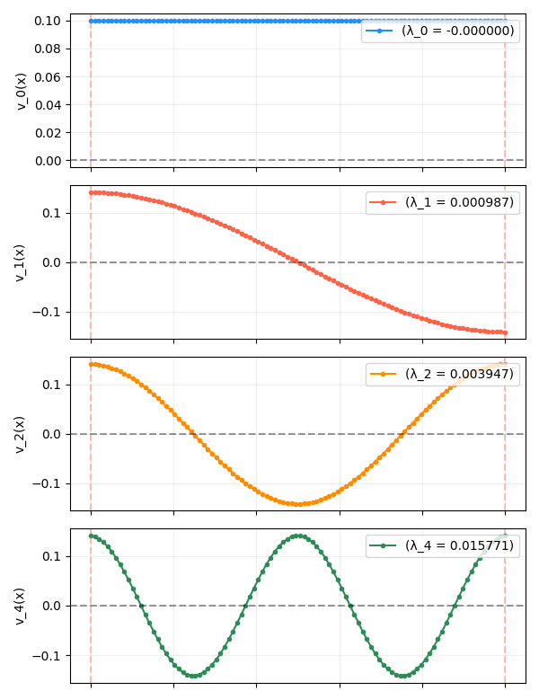
A 1D chain
This is the same graph we’ve been looking at in the previous posts: $n$ nodes, each only connected to its two immediate neighbors (the two nodes at the end of the chain only have one neighbor each). The eigenfunctions (after the constant one) are the simple sinusoidal functions we’ve seen so many times before:
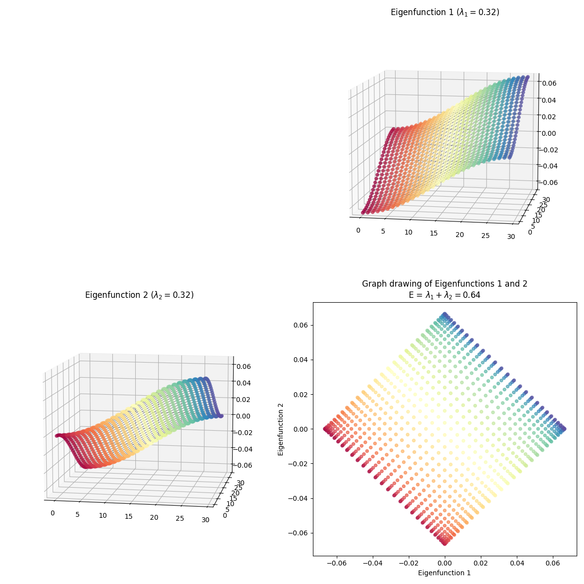
Now we’re effectively taking one of these rows, and matching it with another row point by point, so the pairs of matched points form 2D points, which we can plot in 2D space. For example, even though I said above that we usually skip the first eigenfunction, it’s actually useful to see what the 1st and 2nd eigenfunctions look like plotted together here:
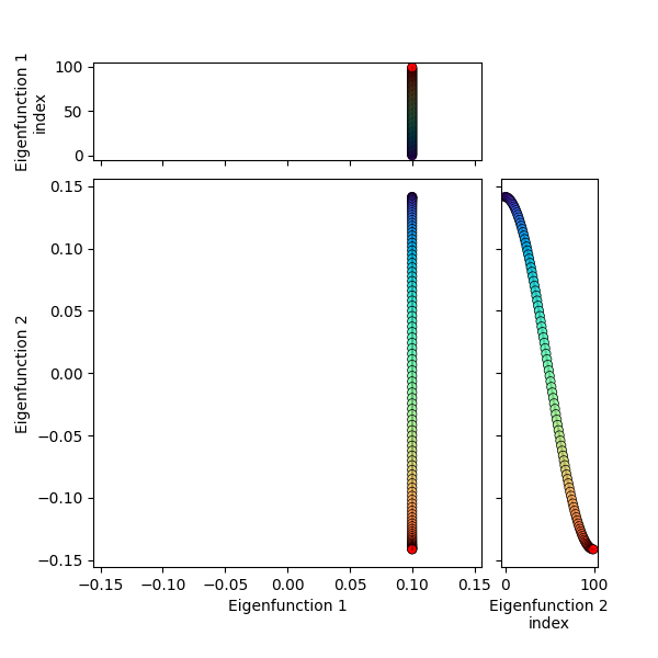
You can see that the 1st eigenfunction is constant, and hence all the points have the same coordinate in that dimension, while the 2nd eigenfunction varies in its dimension, illustrating the “bunching up” at the edges.
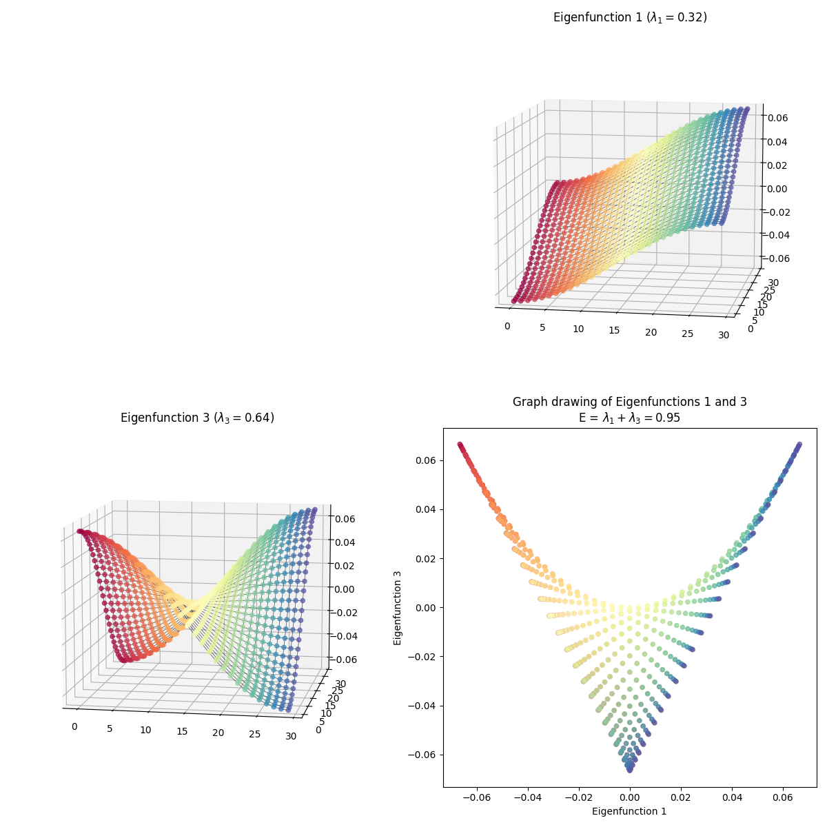
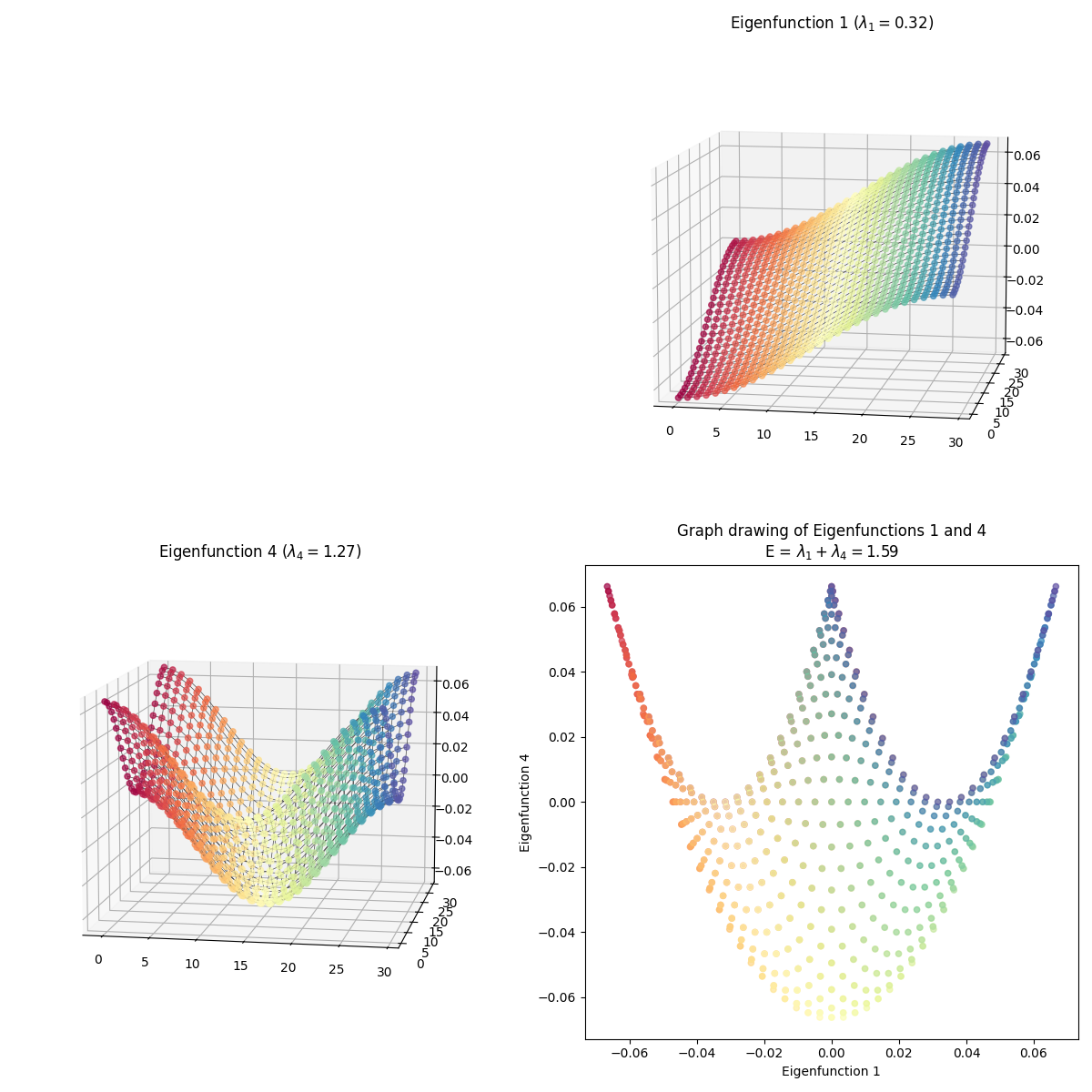
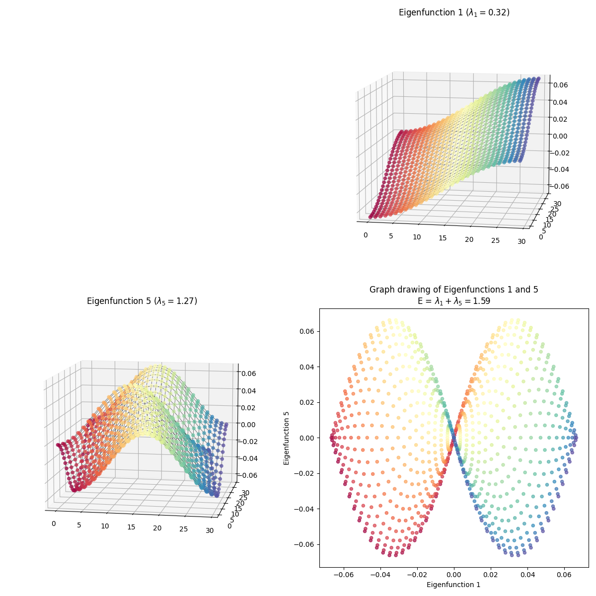
Anyway, it’s more fun to plot the non-constant eigenfunctions against each other. Here, I’ve plotted the first few against each other, along with the actual 1D eigenfunctions on the sides of the plot:
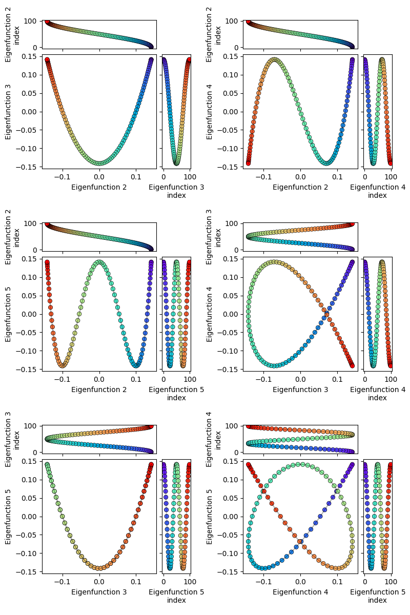
You can see that their 2D representations are pretty much a subset of some of the Lissajous curves, since they’re both just sines plotted against each other.
A flat 2D manifold
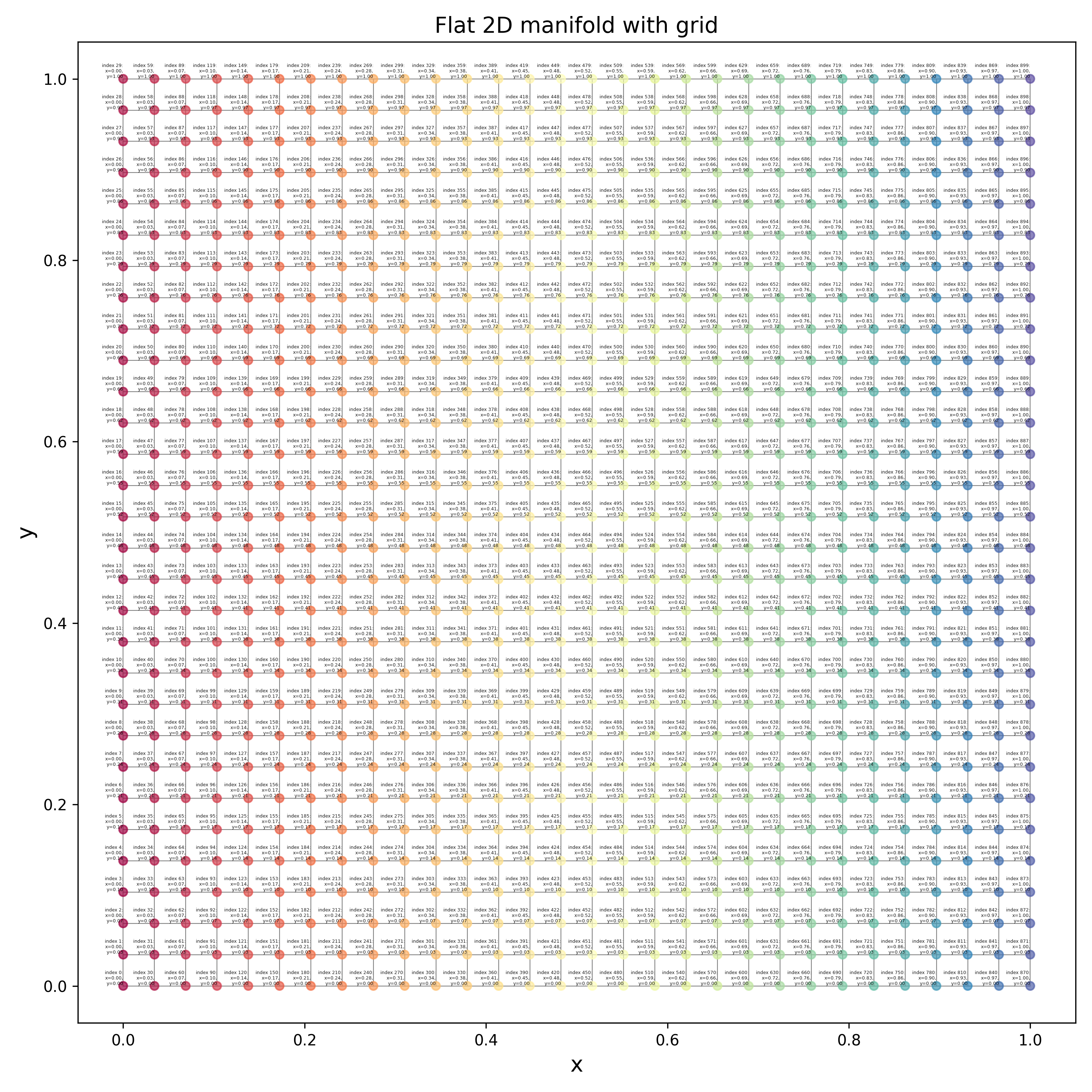
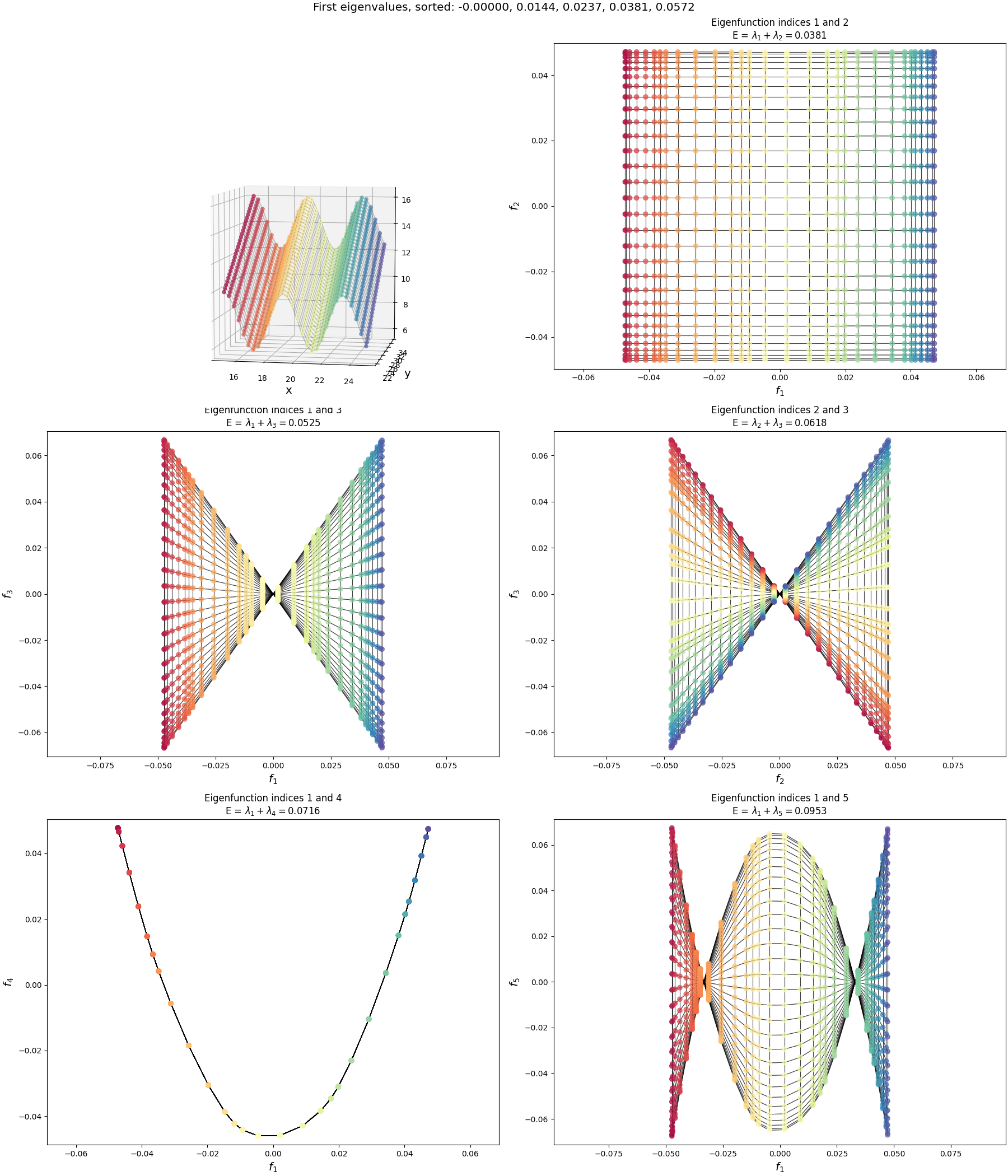
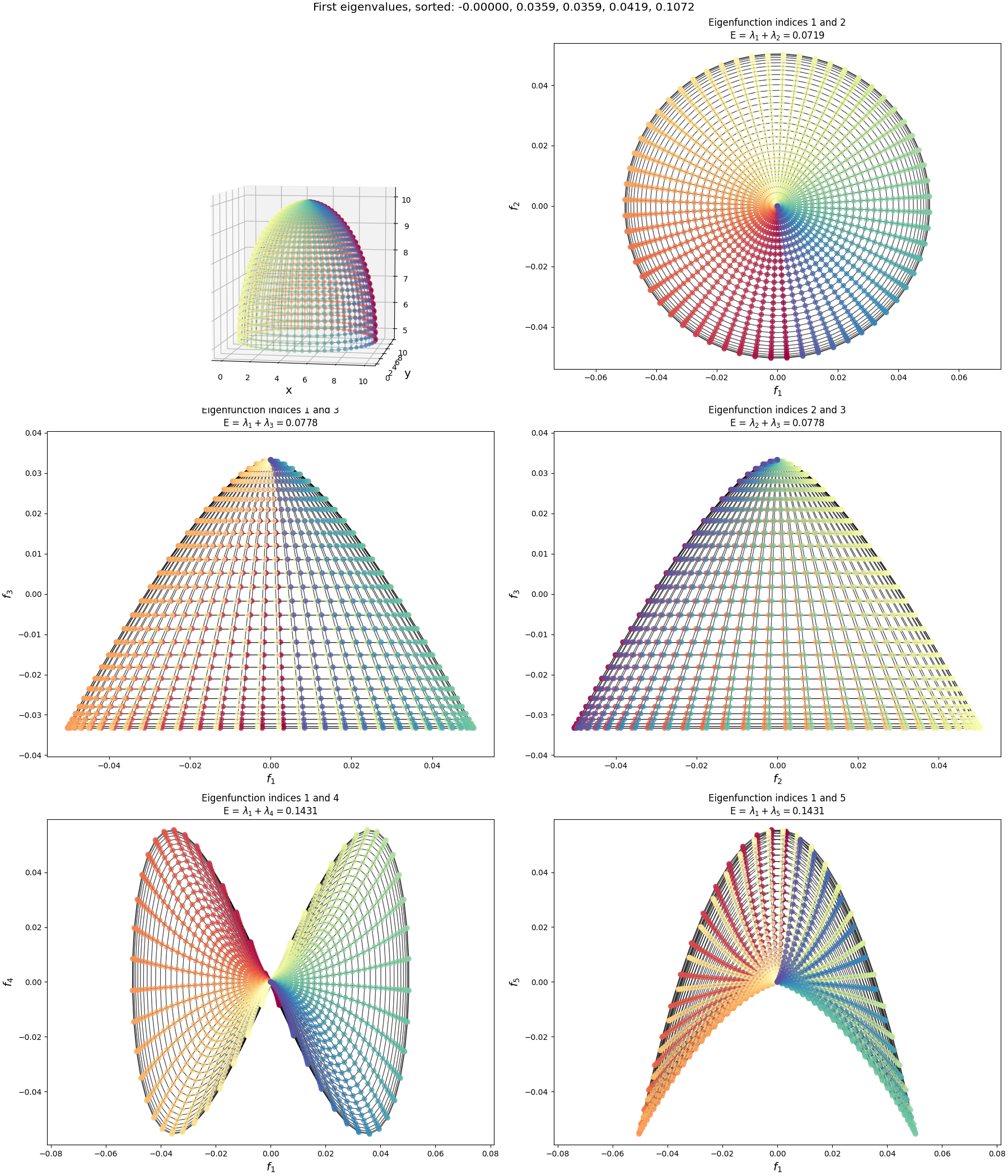
Now let’s look at the eigenfunctions and graph drawing of the graph for a flat, 2D manifold. What I’ve done here is create a graph that just has a rectangular grid of nodes, spaced equidistant, and connected each to its neighbors, like so:
Now we can look at the eigenfunctions of this graph, but it’s a bit more complicated so it’s worth saying clearly:
Even though this graph clearly looks “2D” because of the connections between nodes, at the most generic level it’s no different from the “1D” graph above. For example, in the code, the graph is simply a flat list of nodes, and any connections between them are defined by the adjacency matrix, in both the “1D” and “2D” graphs. Each node has a single integer index (the “graph index”) that the adjacency matrix entries are in terms of. It doesn’t matter how the indices are assigned to the nodes, as long as the weights in the adjacency matrix are correct for each pair (you can see the indices in tiny text if you zoom in on the figure above; it increases in the y direction and then the x direction).
As a result, even though this graph is “2D”, the eigenfunctions produced by np.linalg.eigh themselves are still 1D vectors assigning a value to each node. When we looked at the 1D graph previously, the node indices were just assigned to the 1D chain nodes, increasing from left to right, so we could directly plot the eigenfunctions as a 1D curve to see their shape.
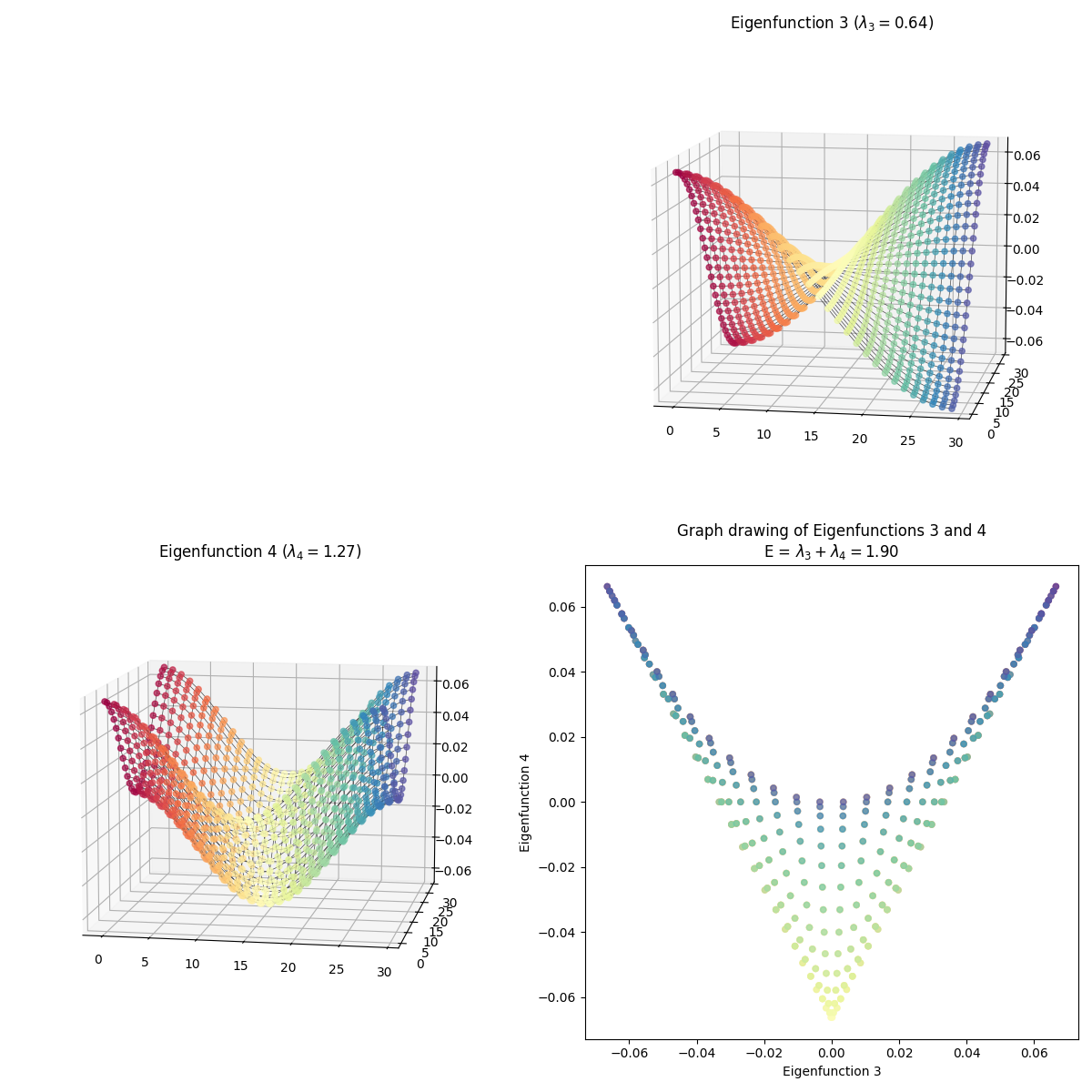
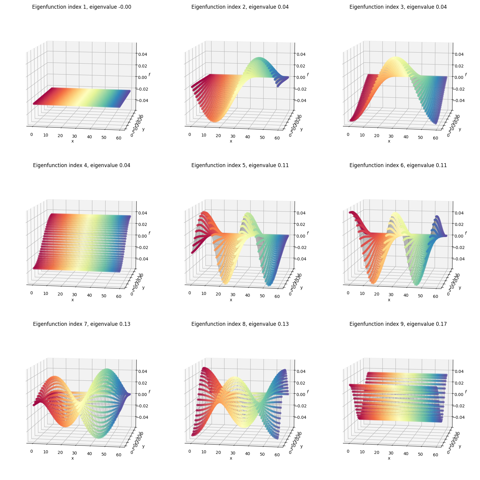
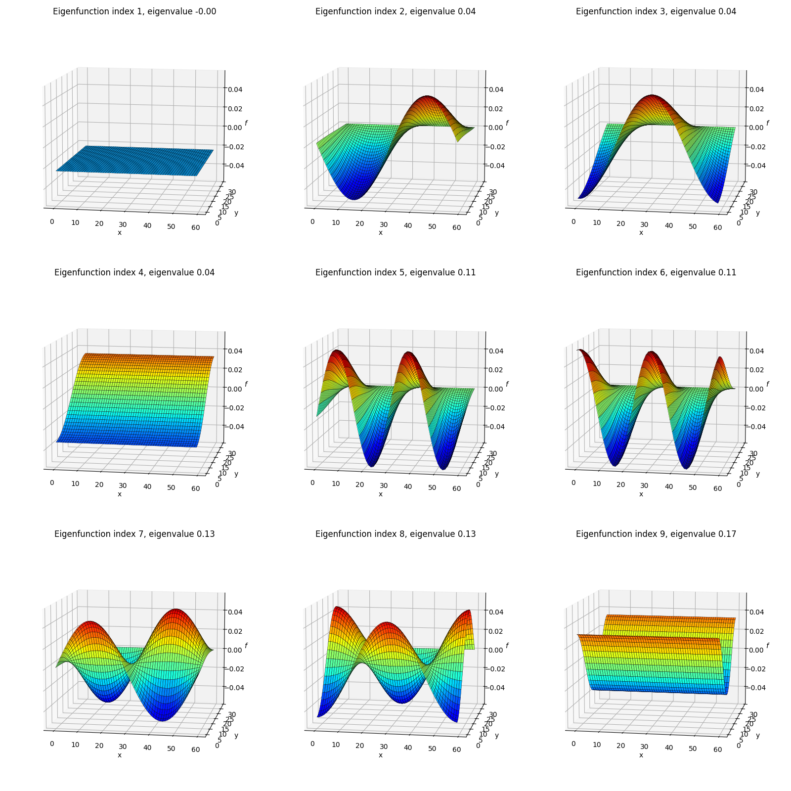
But for 2D, that wouldn’t show us much – the node indices don’t have much relation to their 2D positions in the graph, so the eigenfunction components would be all jumbled in 1D. So to actually see the shapes of the eigenfunctions in a way that makes sense for 2D, we should take each eigenfunction component $i$ and plot it with respect to the 2D position of the graph node with index $i$. I.e., plot the eigenfunction values as heights on a 3D plot, where the $(x, y)$ coordinates are the ones from the original manifold.
I’ve plotted two versions below. First, I’ve plotted the eigenfunctions such that the same graph index/node always has the same color between plots, so we can see what the different eigenfunctions are doing:
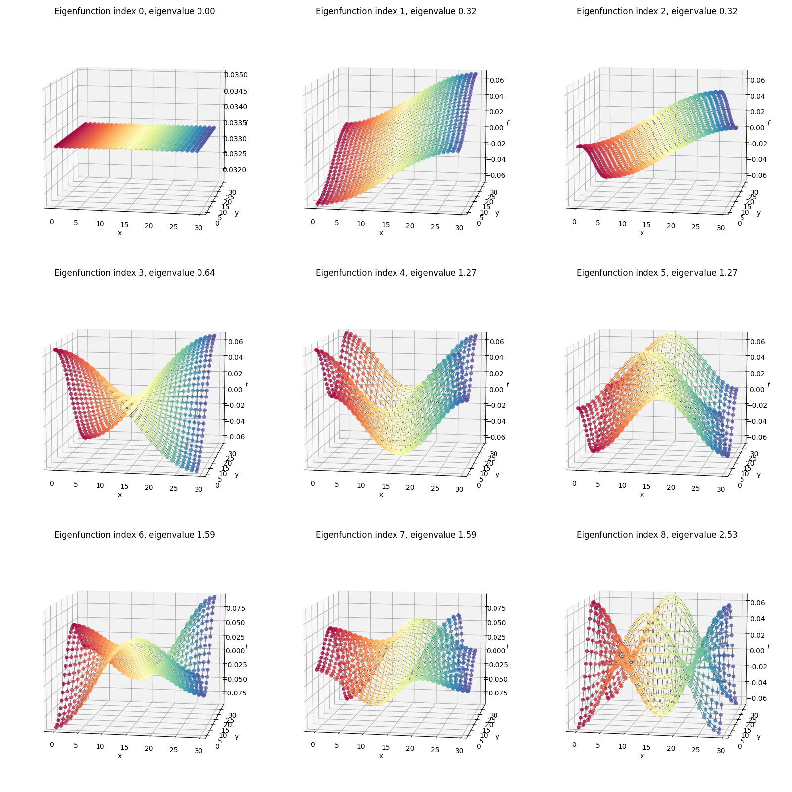 You can compare this to the flat rectangular 2D plot with all the per-node indices/coordinates above. For example, the dark red colored node is the same one in all of the plots above.
Secondly, I’ve plotted each eigenfunction as a surface colored by the height (eigenfunction value):
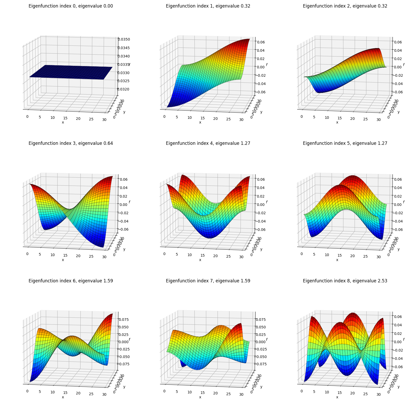
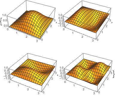
The shapes here might look familiar from various physics classes; however, one difference from most of when I’ve seen these before is that here we’re using von Neumann boundary conditions, so these functions are composed of cosines rather than sines (see the 1D eigenfunctions above) and therefore aren’t all zero at their edges. Here’s an example from Wolfram with the more common Dirichlet BC’s where you can see the functions go to zero at the edges:
So those are the eigenfunctions themselves. Now let’s do graph drawing with them, where we match them up to embed them in 2D:
 For each, I’ve plotted the two eigenfunctions being used in the left and top plots, and then plotted the resulting graph drawing in the 2D plot to the bottom right. Again, the same color corresponds to the same graph node in all of them.
I skipped some of them because they have redundant shapes. For example, compare $(1, 3)$ above to this one, $(3, 4)$:
At first glance, they’re exactly the same shape, but looking more closely, you can see that they’re colored differently – in $(1, 3)$, the blue edge is along the right side in 2D, while in $(3, 4)$, it’s along the top arc. And they are different embeddings! You can see the total energy in the axis title for each, and it’s higher for $(3, 4)$.
Dimensionality reduction with graph drawing
In the above, I was taking the eigenfunctions for a couple of very simple graphs (a 1D line and 2D plane), and drawing those graphs in 2D using pairs of their eigenfunctions. That gives helpful intuition, but isn’t really useful for anything. The real utility of graph drawing is in figuring out the eigenfunctions of high dimensional data, and then doing graph drawing to embed the graph into a lower dimension.
To do graph drawing, we need an adjacency matrix between all pairs of nodes. Previously, like when I did MDS, I generated points in my “higher” dimension of 3D, and then added any connections (nonzero weights) between them based on a couple common strategies like kNN/etc. That worked well enough but it had a few problems around either too few or too many connections getting added, that made the algo work worse.
This time, I’m gonna make life easier for myself and go backwards: take a simple flat manifold that already has all the connections we expect there to be (in fact, the exact flat 2D one above), and transform it to the higher dimensional shape that would be our “data” in a real problem. This means that we won’t need to figure out the connections from the 3D points,
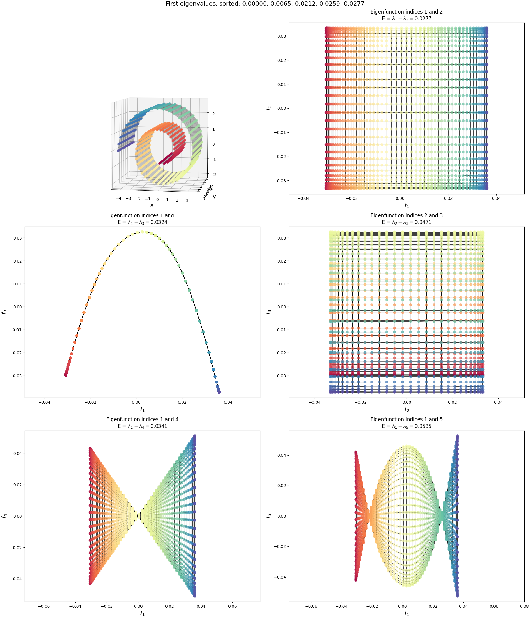
For example, for the wiggly sheet below, I started with the already-connected flat 2D manifold above, and for each $(x, y)$ point on it, transformed it to 3D like:
x = xy_pairs_graph_order[:, 0][:, np.newaxis] * 10.0
y = xy_pairs_graph_order[:, 1][:, np.newaxis] * 6.0

center = np.array([15.0, 22.0, 8.0])
points_3d = center + np.hstack((x, 2 * y, 2 * np.cos(1.5 * x) + y))
I hope that makes sense. Let’s do it for some of the ones I did previously in my posts on MDS and Isomap.
The wiggly sheet:
The Swiss roll:
(Sorry, I dunno why the 3D plots are so small. Matplotlib is the devil.)
What can we say about these?
The first thing to notice is that the lowest energy graph drawing, of eigenfunctions $(1, 2)$, is the same for each, a rectangular grid. This makes sense. We “started” from different shapes, but by construction, they were really essentially the same graph (that flat rectangular 2D manifold), with the same exact connections. Therefore, they should have the same adjacency matrix and same eigenfunctions. Then, we can just look at the graph drawings of the eigenfunctions in the previous section, and no surprise, it’s the same as the $(1, 2)$ one there.
Why are they different at all, then? e.g., why do they have different energies, and different graph drawings of the same eigenfunction indices?
This is for two reasons. First, because after warping the base manifold, they’re actually not exactly the same graph. What I do above is:
- define the 2D array and record which pairs of indices have neighbors
- transform the 2D array to 3D
- iterate through the pairs of nodes with neighbors, calculate their inverse distance, and use that for the adjacency matrix entry
So after doing this, the points aren’t “evenly spaced” anymore. The other reason is that I’m not using the same number of points in the $y$ direction of the Swiss roll as I am “around” the spiral, I’m using 2x more around the spiral to make it more evenly spaced in 3D.
Both of these things together make it so the fundamental graph isn’t an evenly spaced square anymore, it’s more of a slightly-unevenly-spaced rectangle. If I don’t do either of these things, we get:
I.e., exactly what we saw for the 2D eigenfunctions before. So this explains the order difference of the lowest energy graph drawings between the Swiss roll and wiggly sheet: they’re mostly the same shape, but have different “densities” of nodes and slight differences in their non-uniformity due to the curvature of the specific shapes.
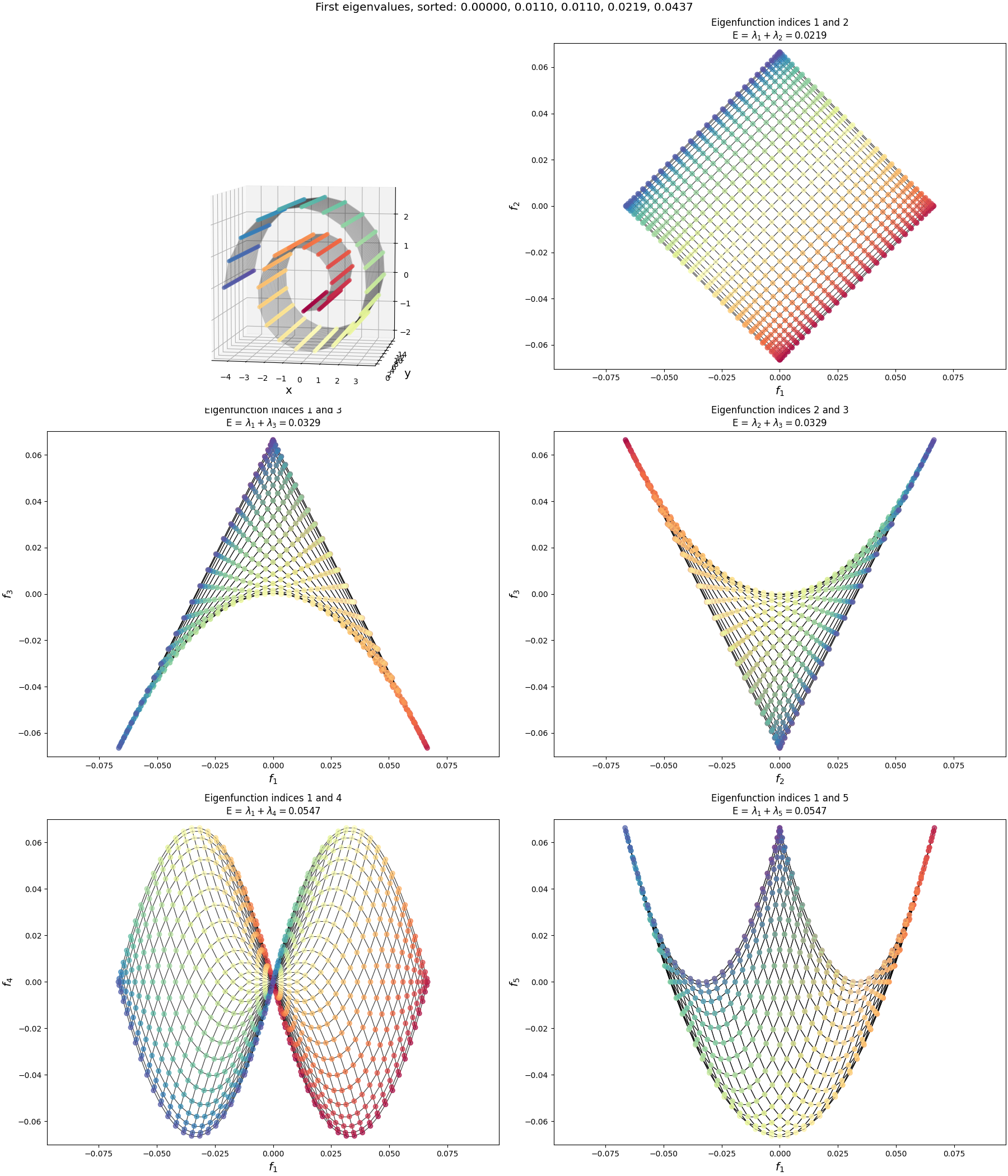
Now let’s look at the half-sphere:
Pretty different from the others! What’s going on?
Well, in this case, it actually is a fundamentally different graph. To make this graph, I started with the same 2D flat rectangular manifold, but then “stitched” the left and right sides together by adding extra connections between them. This effectively created a tube. Then I also add connections between all the nodes along the top edge. Then, I had the 3D transform make the $x$ coordinate of the manifold (i.e., around the tube) act as the $\phi$ spherical coordinate, and the $y$ coordinate (i.e., up and down the tube) act as the $\theta$ coordinate to create the 3D coordinates you can see above. When we calculate the adjacency matrix by using the inverse distances as I mentioned above, the “top” of the “tube” is now connected and very close, and the adjacency matrix reflects this.
But because of these extra connections, it’s an entirely different topology and therefore has totally different eigenfunctions! You can see them here:
You can see that the edge of the rectangle farthest from us has the value for most of the eigenfunctions, which makes sense because it’s effectively the same point, but we see similar patterns along the “bottom” of the half sphere (i.e., the edge closest to us).
The big boys: plots from Koren
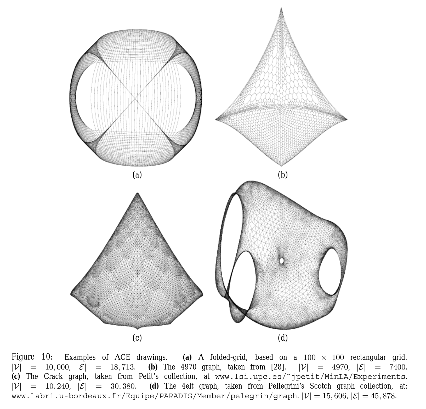
Alright, so the ones above give the basic idea. But they weren’t very impressive: I was using $\approx 1000$ points, and they only had about 4x as many edges. They were pretty sparse and obviously two dimensional.
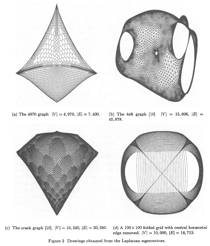
In the Koren paper, they show a few graphs that have been drawn, and I wanted to see if I could do that. These plots have about 10x as many nodes and edges. That may not sound like a big jump, but remember that if we’re naively using np.linalg.eigh, the Laplacian matrix is shape $n_\text{nodes} \times n_\text{nodes}$, so the size increase is effectively 100x. My computer was able to do that in a few seconds. I’m not sure how much fancy stuff they’re doing under the hood with that method, like how much they’re taking advantage of sparsity and such, but when I tried it with these graphs with $n_\text{nodes} \approx 10,000$ and $n_\text{edges} \approx 30,000$, it didn’t solve it after several minutes and my computer was getting reaaaaal jittery. I also tried scipy.linalg.eigh, which should allow me to pass in subset_by_index= and only get the first few, but… that didn’t seem to fix it. From a bit of poking around, I think maybe it’s still doing the full op and just returning the subset you asked for?
Yeah, alright… I’ll admit I thought I was gonna be clever here. I thought, aha! Finally, eigh won’t just stomp the problem, and the power iteration or gradient descent versions I did previously will save the day!
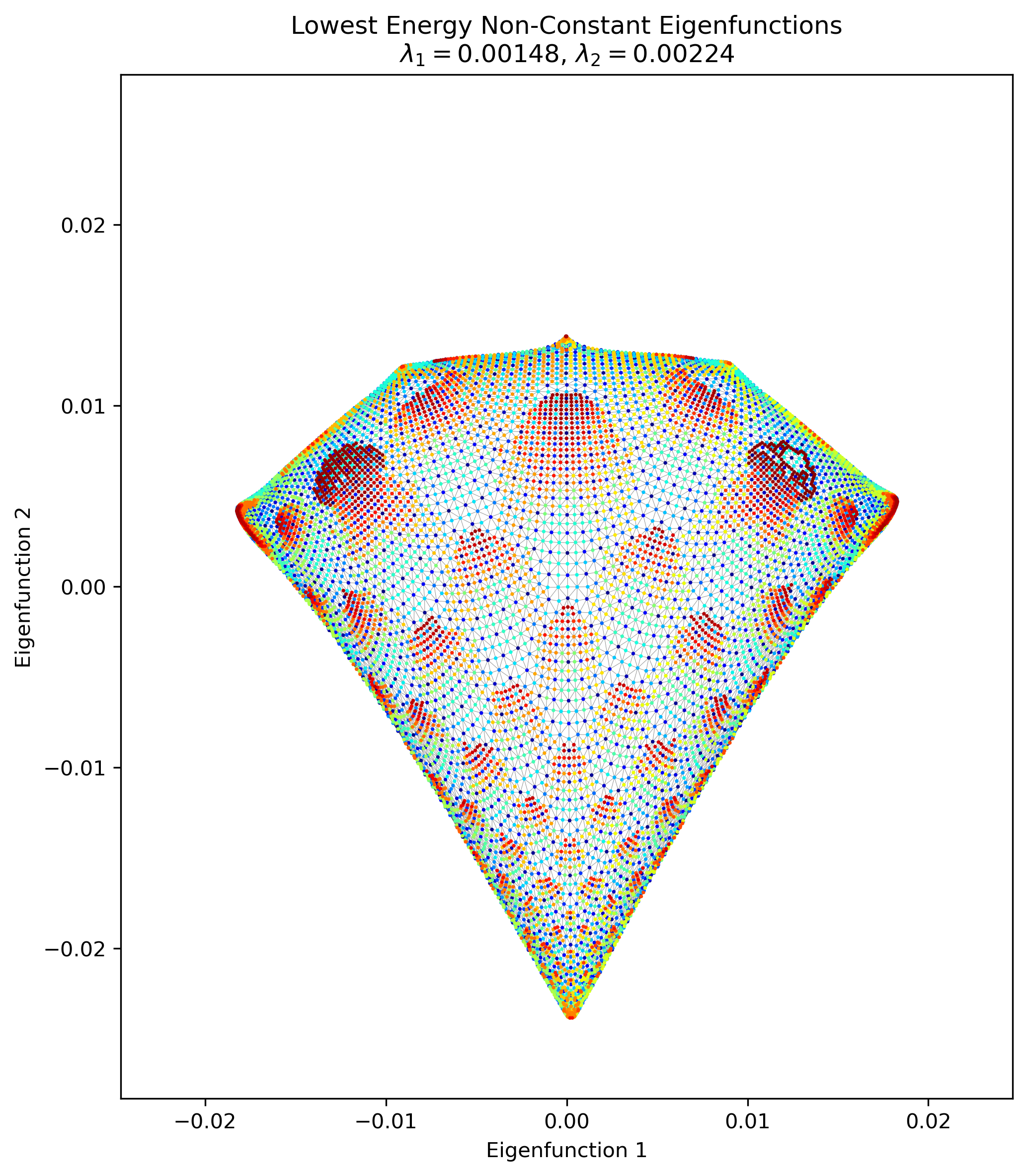
And, I’m happy to report that they actually did work. Here’s what popped out from my gradient descent one for the “Crack” graph:
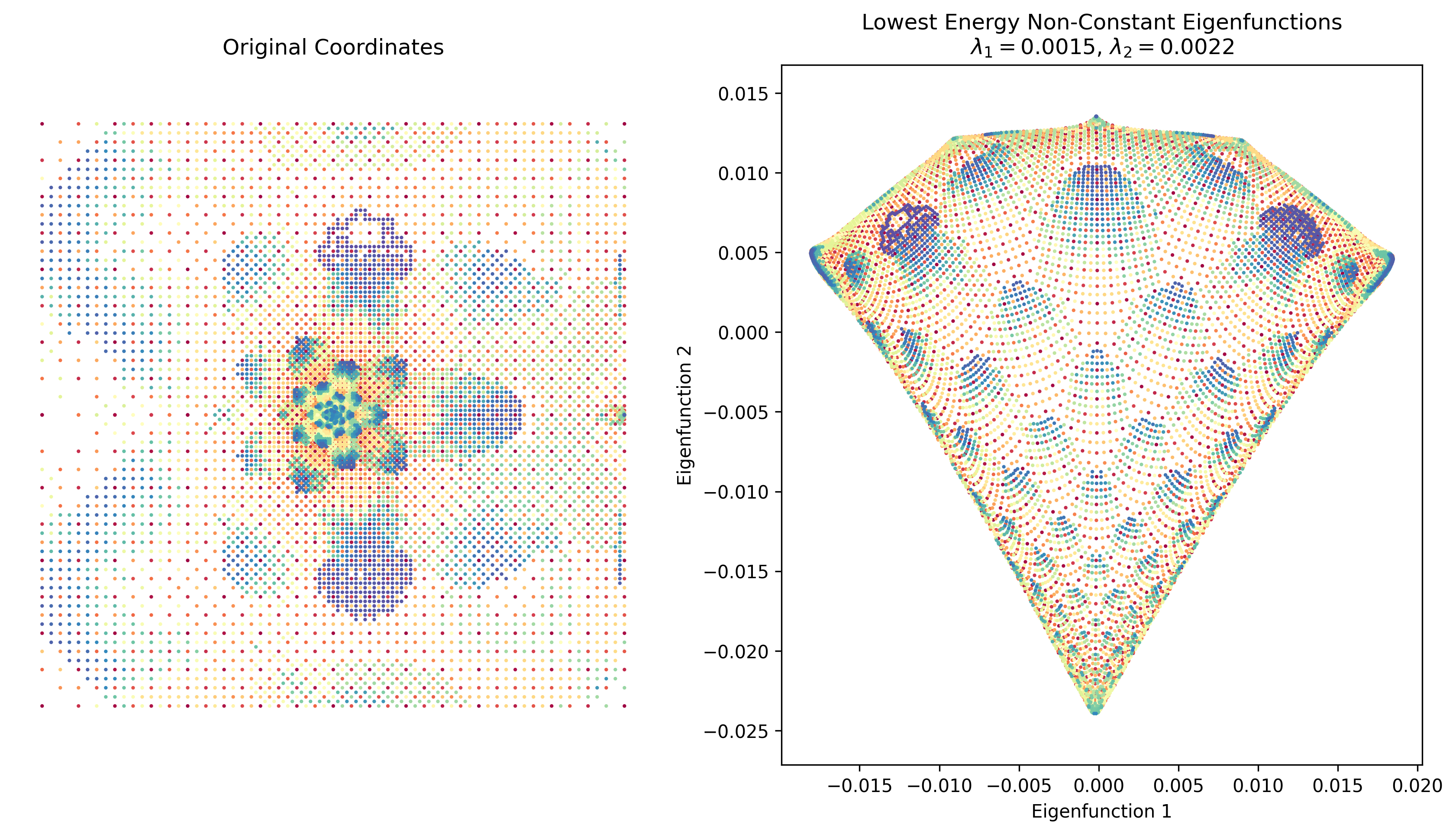
Pretty cool! On the left I plotted the original coordinates in the dataset I found (but of course, there don’t need to be original coordinates, just an adjacency matrix).
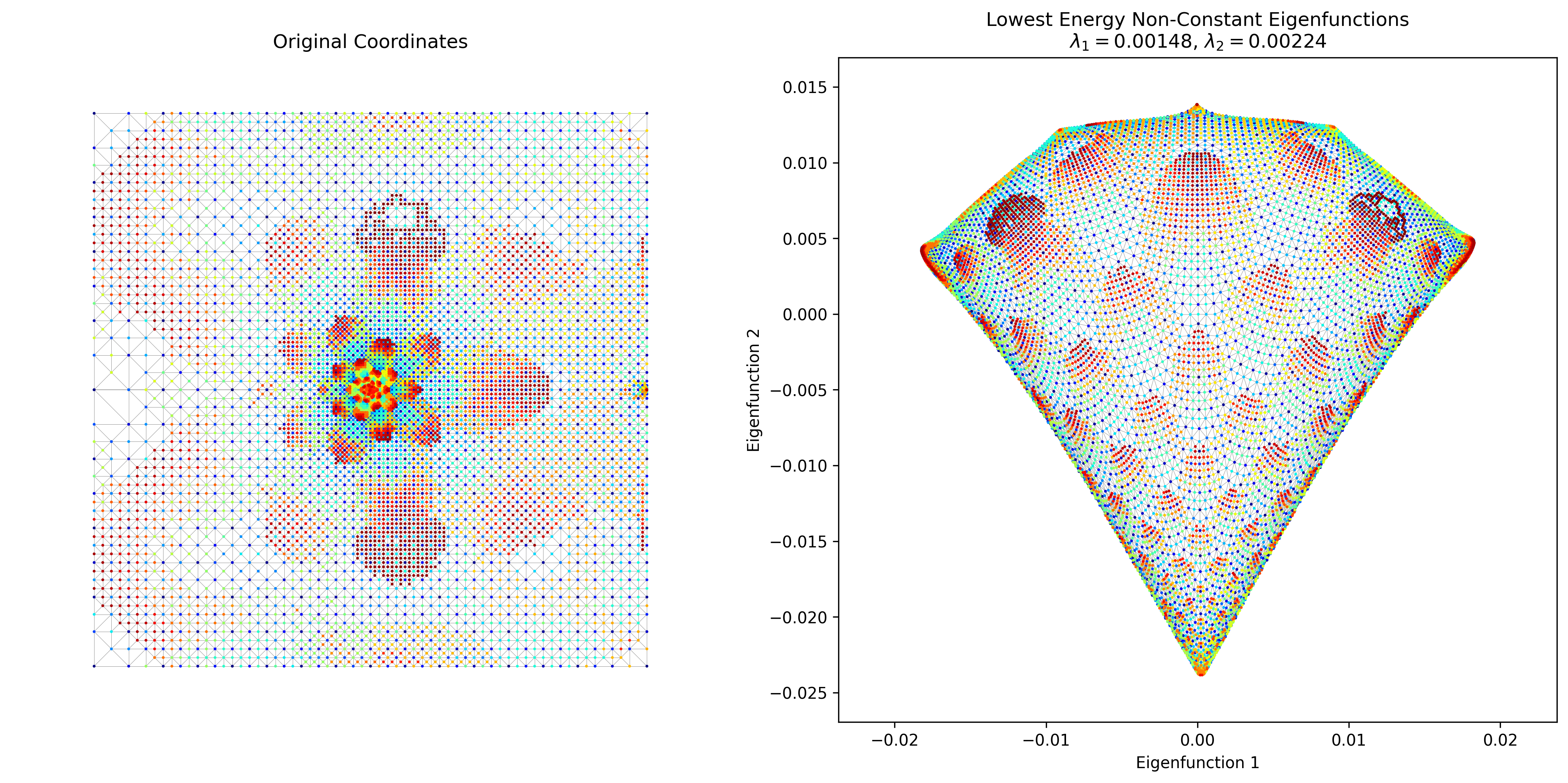
However, this took a decent amount of time to run. I was pretty sure there’s an easy way to do this with a more legit package than my crappy homebrew method, such as, you know, scipy. The answer turns out to be that matrix ops with sparse matrices are WAAAAAAY faster. I basically created the adjacency matrix with scipy.sparse.csr_matrix and got the first 3 eigenvalues/vectors with scipy.sparse.linalg.eigsh (which does actually only find the first three). And… it slammed it in about 1 second. Here’s Crack again:
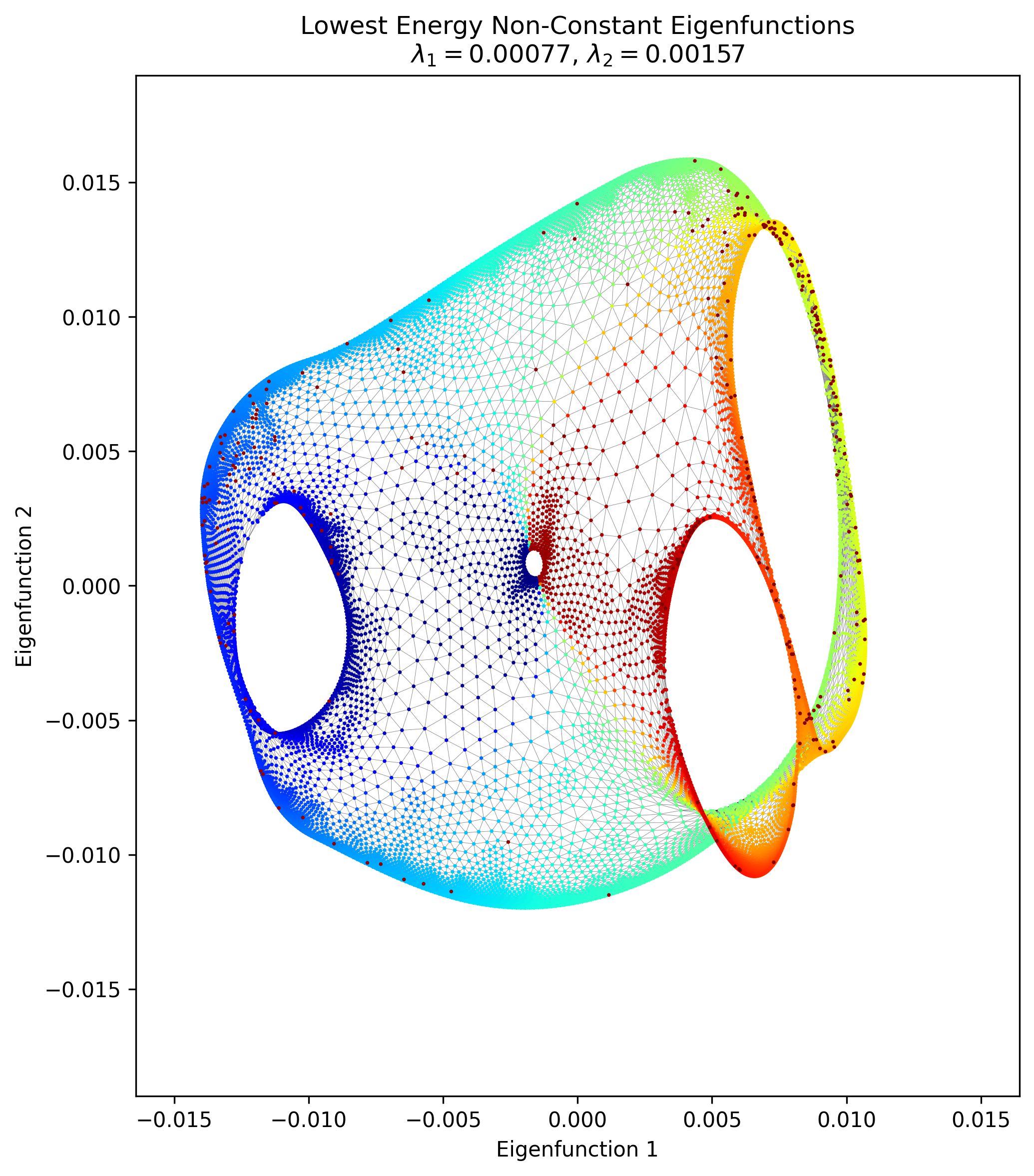
I also managed to find the “4elt” graph in some random repo, which looks very pretty:
Lastly, here’s my attempt of his “100 x 100 folder grid with central horizontal edge removed:
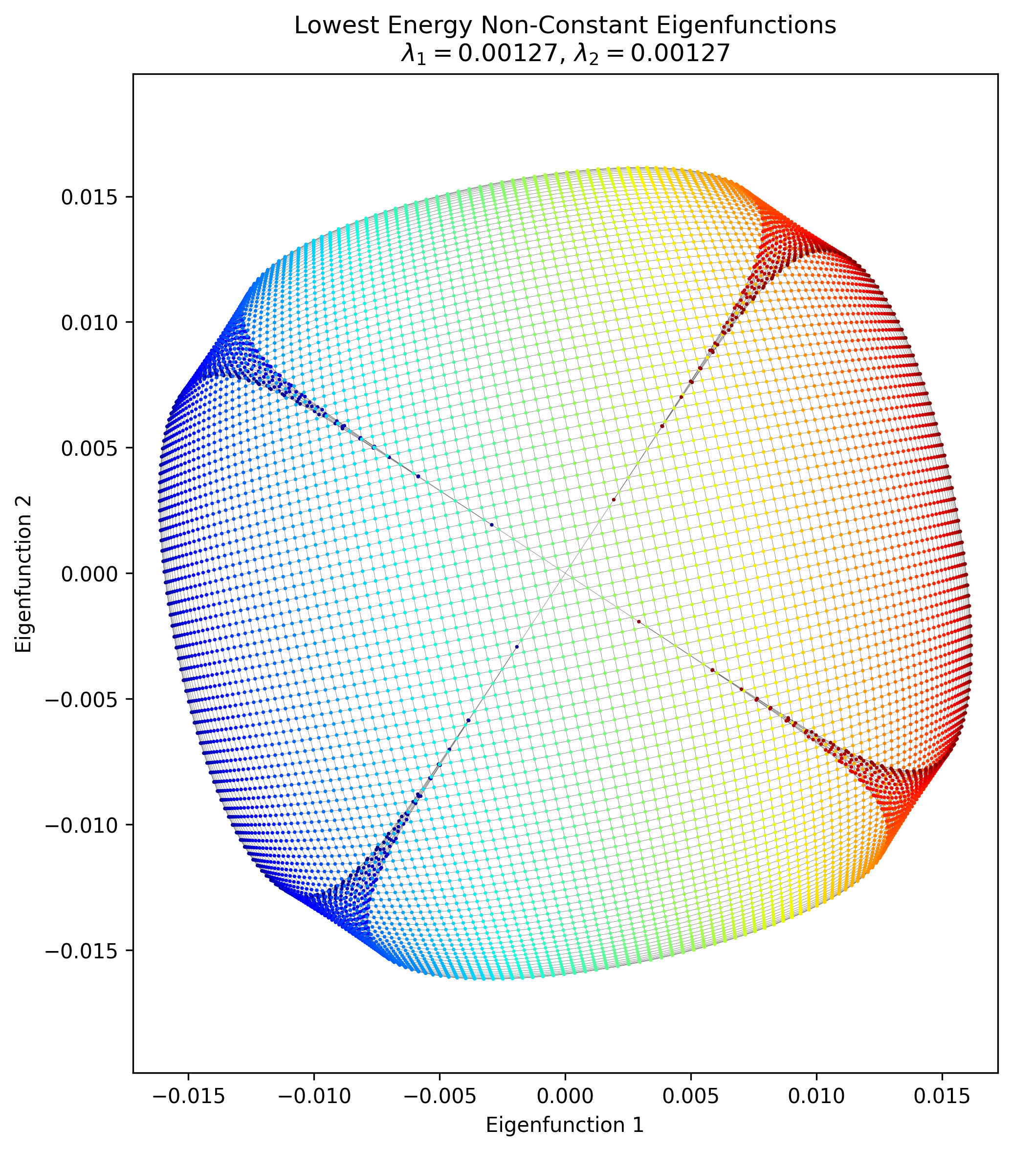
It… has some of the features there, but clearly something is missing. It was clear enough that it’s mostly a $100 \times 100$ graph with local connections, where the opposite corner nodes have been connected. That’s what’s in my pic above. But his says “…with central horizontal edge removed”.
…what? What is a “central horizontal edge” ? I tried a few things to try and recreate it, like removing a single horizontal edge between two nodes in the middle, but as you’d expect that basically didn’t change the structure at all. I also tried removing a whole row’s horizontal edges, but that didn’t do much either. The other thing is that if you naively start with a $100 \times 100$ grid with all possible edges in the cardinal directions, you’ll get $19,800$ edges. I add those two extra to connect the corners, so mine has $19,802$. But his says there are $18,713$ edges, which means $\approx 1100$ have been removed from the full grid… so I really don’t know what that graph means. Let me know if you know!
Yadda yadda
Graph drawing only needs “local” info?
One thing I noticed here is that it in contrast to MDS and Isomap, this method of dimensionality reduction only needs “local” info about connections. I.e., both of those methods need a $D^2$ matrix of the squared distances between every single pair of nodes. Isomap uses MDS, but it basically constructs that matrix in a less naive way. However, that construction is pretty expensive and somewhat error prone.
In contrast, it seems like GD only needs the info about each node’s connections to its immediate neighbors, which is essentially the starting point of Isomap. However, note that it still doesn’t get us away from one of the pain points of the methods above, notably which points to say are connected in the first place. I’m not sure what’s typical in most applications, so maybe this is something you get “for free” in many contexts, but at least in the case of having a bunch of high dimensional data points, they don’t inherently have connections.
Not needing to figure out that global info seems like a huge advantage, but maybe there’s some other big downside I haven’t considered.
Damn, link rot is real
Just as an aside, I was trying to find the actual data for the graphs in the Koren paper and it led me on somewhat of a wild goose chase. His other paper, “ACE: A Fast Multiscale Eigenvectors Computation for Drawing Huge Graphs”, also uses these graphs, with a few references:
Those links are basically all dead. Fair enough, it’s quite possible the owners of those sites might be too 😬 but I figured if they’re used in several papers, they must be standard enough that they’re somewhere. But a lot more searching wasn’t turning up much. I found this link to some weird repo that has a file named 4elt.graph, so that was findable.
I found this cool gallery of many graphs and links to their sources, and that luckily led to this site which has what I believe is the Crack graph. But I can’t for the life of me find the 4970 graph; tell me if you find it!
That’s all for today! But if you think I’m done with the Laplacian now, you’re out of your tiny gourd. There’s way more to do, next time.