Skip to the full page interactive version if you don't want to read the post!
I recently went to MASS MoCA with my friends for the first time. I had heard of it, but assumed they were talking about a huge chocolate flavored coffee drink. So imagine my surprise!
I missed it when they went last year, but they spoke really highly of it, and particularly of one artist's oeuvre (that's the even more pretentious way of saying "works"!): Sol LeWitt. In fact, they liked one of his pieces so much that Ben and Phil made posts on recreating it with code!
So it shouldn't surprise you that when I saw his stuff for the first time, I had the same reaction, loving it and wanting to recreate it programmatically. I thought I'd do one that I liked, one of his big ones with the wordy title "All two-part combinations of arcs from corners and sides, and straight, not straight and broken lines". Here's a sample of it:
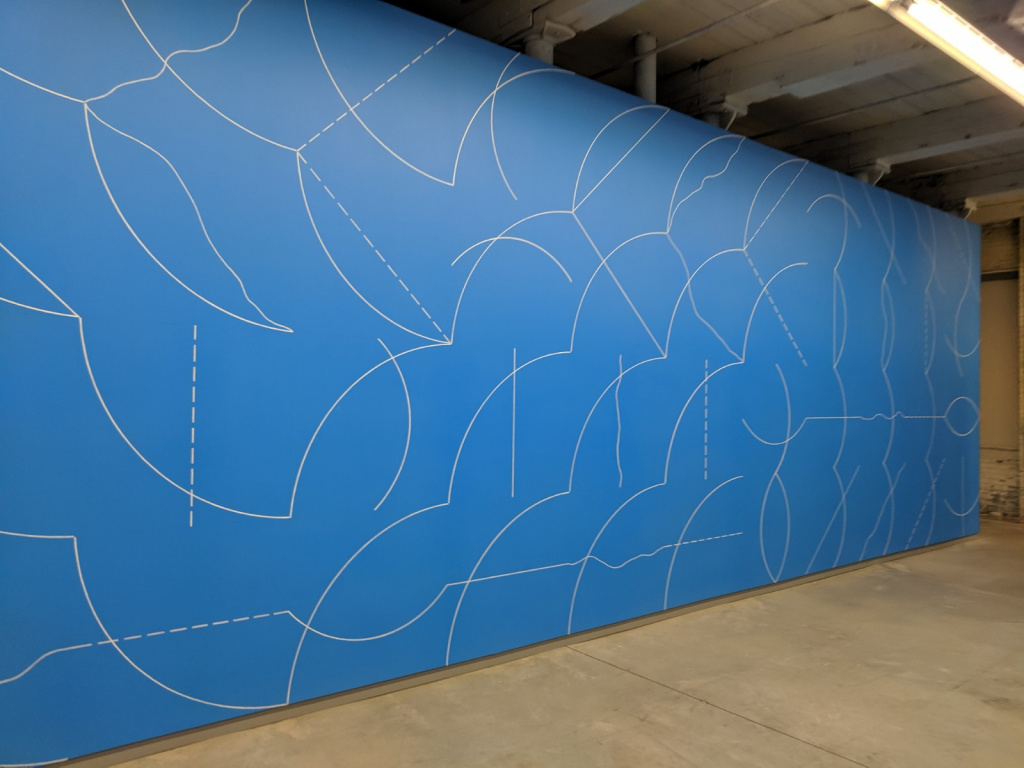
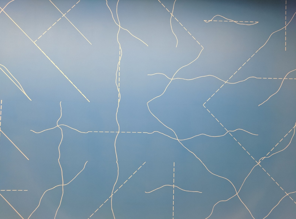
While many (most?) artists make distinct material "pieces" (e.g., there's a single Mona Lisa in Paris), a blurb at the museum mentioned that Sol LeWitt wanted to create "templates" with clear directions, more similar to a composer writing a piece of music, so others could make them (in fact, it seems like the Guggenheim has another version, but with blue lines on white, and slightly different wiggly lines). This obviously appeals to the computer scientist in me! For this piece, as the name might suggest, he started with 20 lines and curves, each fitting inside a square:
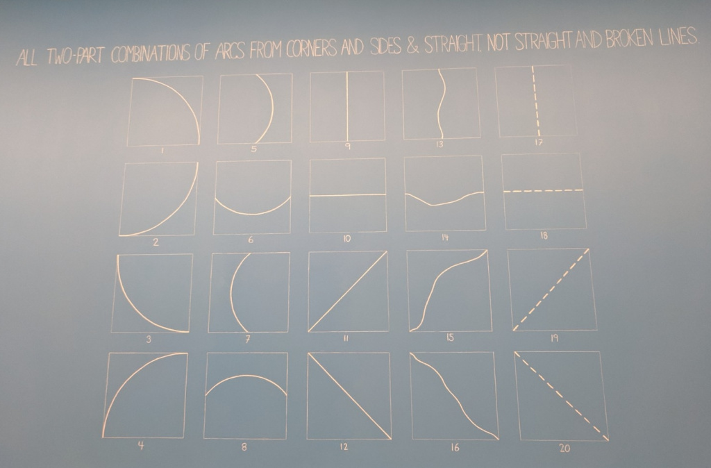
You can see some symmetry, except for the 4th column, which seems like a wildcard he threw in. So that was the first thing to create, like so:
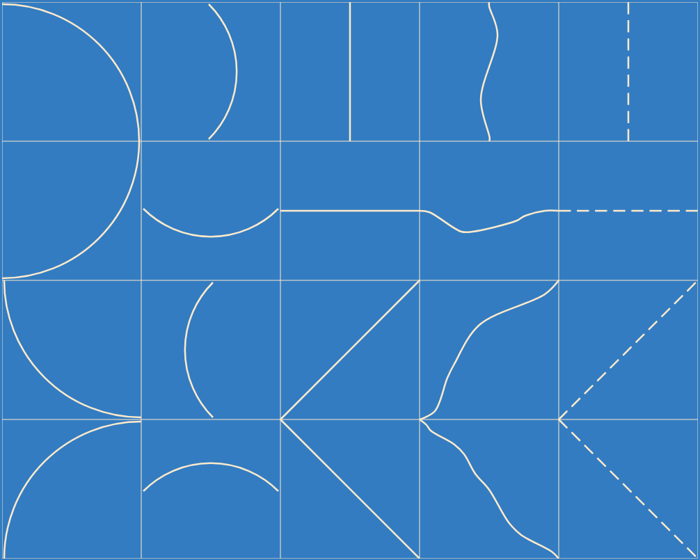
It was pretty easy to create the basic curves and lines, but that weirdo 4th column was a bit trickier. I probably could've done it a few ways, but I ended up creating them by just eyeballing them with splines. And not to toot my own horn, but I'm pretty happy with how close they turned out...toot toot! Also, I took the museum pics above with my derpy phone camera, which mauled the colors, so I chose the blue in my version to match the blue in the first pic above, which was what it was actually like, not the washed out looking blue in the other pics.
He then combined pairs of them to create a square, and creates a grid of them. In the actual exhibit, he paired them by starting with 1 for the first number and 2 for the second, and counting up the second number until it reaches 20 (skipping it when it's the same as the first number), and then ticking the first number up one (and starting the second number from the new first number plus one):
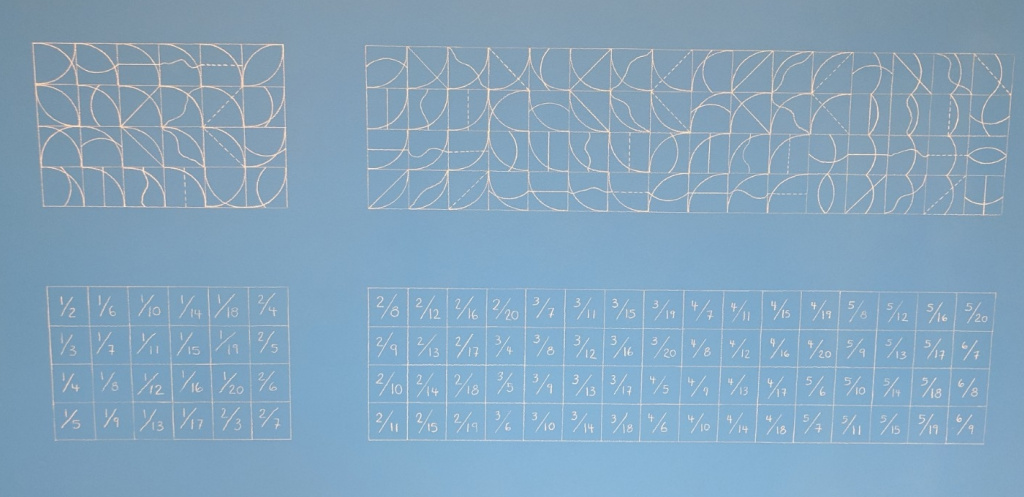
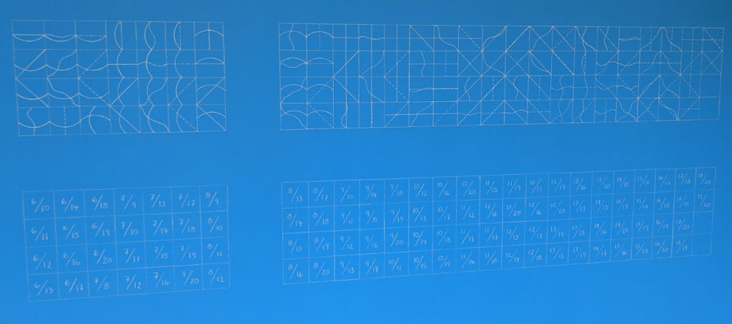
We were wondering about the seemingly arbitrary breaks in the blocks of them. I only realized at home that they corresponded to the 4 walls of the actual exhibit for it in the adjacent room:
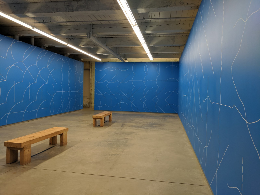
Note that in the real exhibit, there are no grid lines; I guess he just added those to explain to us simpletons.
Here's what a wall produced by my code looks like:
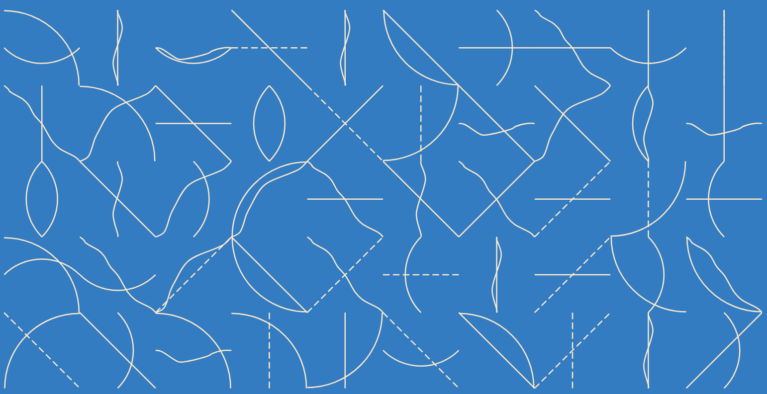
I wanted to create something people could mess around with, so I made a full screen version with d3.js. In it, you can adjust the number of squares across, and save the image if you want to use it as a desktop background!
That's all for now. I'm sure I'll be doing more Sol LeWitt recreations or inspired things, because I'm a big fan. See ya next time!